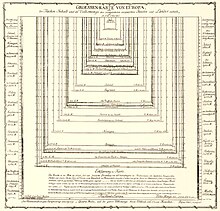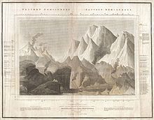
Comparison diagram or comparative diagram is a general type of diagram, in which a comparison is made between two or more objects, phenomena or groups of data. A comparison diagram or can offer qualitative and/or quantitative information. This type of diagram can also be called comparison chart or comparison chart. The diagram itself is sometimes referred to as a cluster diagram.
Overview
A comparison diagram is a general type of diagram, meaning a class of specific diagrams and charts, in which a comparison is made between two or more objects, phenomena or groups of data. They are a tool for visual comparison.
When it comes to comparing data, five basic types of comparison can be determined.
- Comparison of components, for example the pieces of pie chart
- Item comparison, for example the bars in a bar chart
- Time-series comparison, for example the bars in a histogram or the curve of a line chart
- Frequency distribution comparison, for example the distribution in a histogram or line chart
- Correlation comparison, for example in a specific dot diagram
Comparison diagrams can be used in research projects, to give an overview of existing possibilities and to validate models. It can be used in decision making in presenting alternatives for further selection. And it can be used in education to show the variety in a specific population.
History
Origins

Comparison charts originate from the late 18th century and early 19th century. One of its roots are the 18th century nautical chart, which could offer a comparison of shore or coastal profiles. These were made popular by the English cartographer and a publisher of maps William Faden (1749–1836).

Another root of comparison diagrams are the earliest thematic maps. In France in 1872 Charles-René de Fourcroy published one of the first economic thematic map, which he named "Table poléométrique" (Poleometric Table). Late 18th century August Friedrich Wilhelm Crome presented a diagram, named "Groessen Karte von Europa" from 1785, where he compared the sizes of all then existing European countries. This work inspired later scientist, such as Alexander von Humboldt in Germany, and Charles Dupin in France in their works.

Early 19th century, Alexander von Humboldt was one of the first to picture various cross sections of mountains, including for example the "limit of perpetual snows at different latitudes," or the different kinds of vegetation on different heights. Much of this work was published in the 1914 "Atlas géographique et physique des régions équinoxiales du nouveau continent." In 1805 Von Humboldt had published a map (see image), entitled "Ideen zu einer Geographie der Pflanzen nebst einem Naturgemälde der Tropenländer" (Ideas for a geography of plants, together with a nature paintings of the tropics) in which he made a comparison of the different types of plans in the tropics, and the heights on which they grew.
First comparative charts

In the 1810s the first formal comparative mountains charts emerged. Early examples are:
- Charles Smith's Comparative View of the Heights of the Principal Mountains &c. In The World, published in London in 1816
- John Thomson's A Comparative View of the Heights of the Principal Mountains and other Elevations in the World. published in the 1817 edition of Thomson's New General Atlas.

Another popular subject became the comparative views of the lengths of the principal rivers in one country or from all over the world. In 1822 William Home Lizars presented a map, entitled "Comparative View of the Lengths of the Principal Rivers of Scotland." And in 1826 Anthony Finley (1790–1840) published a "Comparative Map of the Principle Rivers of the World."
Other types of comparison charts would soon appear. For example, the "Comprehensive atlas: geographical, historical & commercial," published by William D. Ticknor in 1835 contained a series of different comparison diagrams and charts on:
- Size of Continents, Oceans, Islands
- Heights of Mountains
- Lengths of Rivers
- Size of animal
- Size of planets
- Heights of monuments
- Height of edifices
- Different countries
Other popular themes in 19th century comparison diagrams were the sizes of lakes, the lengths of waterfalls, and the sizes of Islands.
One of the first maps to compare the lengths of rivers was the "Map of the Principal Rivers Throughout the World. Comparative Lengths of the Principal Rivers throughout the World." by the political economist Henry Charles Carey and Isaac Lea published their 1822 "A Complete Historical, Chronological, and Geographical American Atlas." In this maps the lengths of the rivers, were presented in a bar chart with horizontal bars. In 1826 the same data was presented in a bar chart with vertical bars, entitled "Table of the comparative lengths of the principal Rivers throughout the World" (see image).
20th century
In his Graphic methods for presenting facts. Willard C. Brinton was one of the first to theorize about the existence and role or comparison in statistical graphics. He stipulated that "the graphic method lends itself admirably to use in making comparisons. It is surprising how much clearer even simple comparisons of only two or three items will appear when their numerical value is put in graphic form rather than in figures." Brinton showed over a dozen different types of diagrams, which could make simple comparison, and devoted another chapter on comparisons over time.
Types of comparison diagrams
There are different types of comparison diagrams called comparison diagram/chart in theory and practice, such as
- Table, data visualized in a tabular form
- Matrix based models, for example the balanced scorecard
- Quantitative charts such as line chart, bar chart, pie chart, radar chart, bubble chart, scatter diagram etc.
- Scale comparison diagram
- Comparison map or comparative map.
References
- Joint Commission Resources, Inc (2002). Tools for Performance Measurement in Health Care: A Quick Reference Guide. p. 55.
- Fill, Hans-Georg. "Survey of Existing Visualisation Approaches." in Visualisation for Semantic Information Systems. Gabler, 2009. 39-159.
- Taylor, Karl E. "Summarizing multiple aspects of model performance in a single diagram." Journal of Geophysical Research: Atmospheres (1984–2012) 106.D7 (2001): 7183-7192.
- ^ Wolter, J. A., “The Heights of Mountains and the Lengths of Rivers”. at davidrumsey.com/blog, 2009/9/5
- Gilles Palsky (1996): Des Chiffres et des Cartes, p.51-52; Translated by Daniel J. Denis. "Des Cartes Generates Aux Cartes Spectates" at euclid.psych.yorku.ca, April 7, 2002.
- Friendly, Michael, and Daniel J. Denis. "Milestones in the history of thematic cartography, statistical graphics, and data visualization." Seeing Science: Today American Association for the Advancement of Science (2008). p. 13
- R. W. Anson, F. J. Ormeling, International Cartographic Association (1993). Basic cartography for students and technicians. Vol. 1. p. 18
- David N. Livingstone, Charles W. J. Withers. Geography and Enlightenment. 2010. p. 252
- Nicolaas A. Rupke (2000), Medical History: Supplement. Nr. 20, p. 171.
- Palsky, Gilles. "Connections and Exchanges in European Thematic Cartography. The case of XIXth century choropleth maps." Formatting Europe. Mapping a continent. 2007
- Debarbieux, Bernard. "The various figures of Mountains in Humboldt’s Science and Rhetoric." Cybergeo: European Journal of Geography (2012).
- Illustrations de Voyage de Humboldt et Bonpland, première partie. in Relation historique. Atlas géographique et physique du nouveau continent. at gallica.bnf.fr. Accessed 11, 2014
- The Evolution of the Comparative Mountains and Rivers Chart in the 19th Century Archived 2014-11-04 at the Wayback Machine at geographicus.com. Accessed Nov. 4, 2014
- "Comparative View of the Lengths of the Principal Rivers of Scotland." by William Home Lizars, 1822.
- Bradford, Thomas Gamaliel. Comprehensive A Comprehensive Atlas: Geographical, Historical, & Commercial. JH Wilkins & RB Carter., 1835.
- See here
- Brinton, Willard Cope. Graphic methods for presenting facts. Engineering magazine company, 1917. p. 20
External links
- The Evolution of the Comparative Mountains and Rivers Chart in the 19th Century at geographicus.com